
Standard, Graphic, or Premium Cover: Which Level Does Your Book Actually Need?
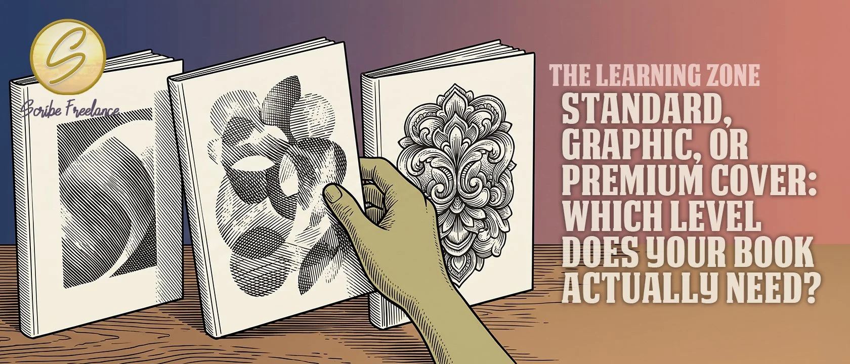
The tiers aren’t ranked by price. They’re ranked by how much the cover has to say at once.
Most authors comparing cover tiers start with the price column. The right tier actually comes down to what your book’s genre and content need the cover to communicate — not what you’re willing to spend.
I’m Daniel J. Middleton, and I’ve spent close to two decades designing books for authors and publishers.
This piece breaks down what actually changes at each tier, using the real definitions behind the rate card, and the one signal that should drive the decision instead of price.
What Actually Separates a Standard, Graphic, and Premium Book Cover?
Standard ($400 paperback / $525 hardcover) is a single, carefully chosen image with tasteful typography laid over it. Clean, classic, and a real design in its own right — not a placeholder tier.
Graphic ($525 paperback / $650 hardcover, and the tier most authors land on) blends multiple elements into one composition built to stand out on a shelf or in a marketplace grid, rather than resting on one strong image alone.
Premium ($850 paperback / $1,025 hardcover) is built around fully custom artwork — illustration created specifically for the book through detailed art direction, nothing template-based or stock-composite. It’s the tier comparable to what a major publisher would commission in-house.
All three are already priced as one-piece covers, front, back, and spine together — there’s no separate charge to stitch the spine on afterward. The hardcover rate above is for a dust jacket; a casewrap cover deducts $25 from whichever tier you land on.
Why Do Most Authors Pick the Wrong Book Cover Tier?
Because price is the only variable that’s easy to compare. Three numbers sit next to each other, and the natural instinct is to anchor on the cheapest one that fits the budget, or the most expensive one that signals “serious book.”
That instinct skips the actual question. The tiers aren’t ranked by how much attention the designer pays — they’re ranked by how many distinct design decisions the cover needs to hold at once. A single striking image can carry a literary novel. It can’t carry a book whose cover needs to signal three or four things simultaneously.
What Should Actually Drive the Book Cover Tier Decision?
Genre convention and what the book’s content demands — not the number at the top of the quote. The real question is which of these actually describes your book:
A genre that demands heavy illustration and multiple rounds of refinement. A four-book thriller series for author J. Lee needed the Premium tier on every cover — original illustrated artwork, several rounds of edits and versions, and graphic elements adjusted until they worked together as a set.
A distinct personal framework or brand identity. Memoir and self-help titles built around the author’s own coaching tools or personal brand — Stay Thirsty and Greatness Is a Verb among them — have both landed at the Graphic tier: enough distinct elements to stand apart, without needing fully custom illustration to do it.
A single strong idea, well executed. Plenty of books need nothing more than one carefully chosen image and clean typography. Standard isn’t the budget option in that case — it’s the correct one.
The tier that fits is the one that matches what the cover has to communicate — not the one that matches what the budget allows.
What Cover Tier Did a Real Project Actually Need — and Why?
Greatness Is a Verb, which highlights a life of success through service, is a self-help and memoir hybrid built around Keith Sodan’s own coaching tools and frameworks. Keith wrote it with Mike E. Brown, brokered through John Clark. I quoted it at the Graphic tier — not Standard, not Premium.
Not Standard, because a single stock-style image couldn’t hold the coaching-framework content the cover needed to gesture toward. Not Premium, because the book didn’t need a fully custom-illustrated identity to do that job — a well-built multi-element composition could carry it without the added cost of ground-up custom art. Graphic was the correct tier on content grounds, not a default and not a compromise.
The same project needed a different kind of tier call on the interior — covered in the companion piece on interior tiers.
What Does the Price Jump Between Book Cover Tiers Actually Buy?
The step from Standard to Graphic is a real increase, but a manageable one — $125 on the paperback, $125 on the hardcover. The step from Graphic to Premium is bigger, roughly $325 on either format. That gap tracks a real difference in scope, not a markup: composing several existing elements into one design is different work from directing original artwork into existence from scratch.
Neither jump is arbitrary. Each one reflects a genuinely different amount of design work, not a nicer coat of paint on the same job.
What Should You Check Before You Book a Cover?
Look at what your genre’s shelf actually looks like, and what your book’s content needs the cover to hold — a mood, a single image, several ideas at once, or a fully original visual identity. That’s the real signal, and it points to a tier on its own once you’re actually looking at it instead of the price column next to it.
If you want to see exactly where your book lands, the service rates page breaks down all three cover tiers, plus the interior and ebook tiers alongside them, in one place.